If you’ve ever looked at the world’s most popular logos before, you’d be surprised to see that a good amount of them are really just letters. Most logos are just stylized type. The thing is, while it sounds simple to make, there’s actually a lot of thought that goes into it.
I realized this when I attempted to create logo stickers of my name. The two different logos I tried to make stickers of are the initials of my first and last name and a shortening of my last name. Here are my three favourite attempts:

Why do these logos look good design wise?
I believe that all these different logos work for their own reasons.
The first logo is an illustrated capital letter. It looks good because of it’s elegant design and it’s gradient colour.
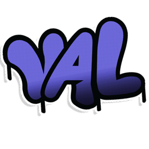
The second logo is drawn in a graffiti style. It works because of it’s energetic look and stylized lettering. The black outline resembling dripping paint also helps it feel like actual graffiti.
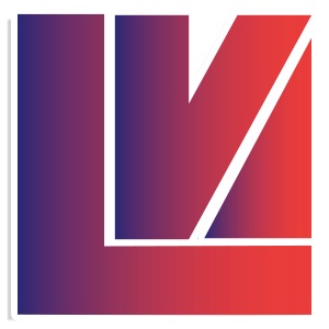
The third logo is a monogram. The reason it looks good is because of it’s shape. The logo is made to fit within the shape of a square which gives it visual balance.
What did I learn from this project?
Every design in this assortment of differently styled logos has it’s own unique style. They all look good but in a completely different way. The secret to designing a good logo starts with finding a style. Making a logo using only type can be difficult. Some letters don’t fit together as well as others which can make certain combinations challenging.
If you’re interested in learning about other types of logos, I’ve also tried creating a logo that didn’t use type. You can learn about how I did that in my blog post, “Creating an iconic logo: Harder than it seems!”